
First, we apologize for not providing as much free advice and content on the website/social media/etc. Much of our content and ideas gets plagiarized, so please contact us for inclusion in our private mailing list.
Nevertheless, we wanted to share one piece of advice that frequently gets overlooked, but makes a huge different in our split testing of marketing campaigns and websites…COLOR!
Typically, people just choose the color that suits THEIR personal tastes and not colors that suit their BRAND or industry.
Believe it or not, there have been in depth studies done on how much color communicates. It often communicates more than words on a website because so many people only browse the text.
Thus, it’s important to choose the right color for your target audience and attributes that you want to subliminally communicate without having to rely solely on words.
Remember, people respond psychologically to color. Artists use colors all the time to draw our attention to particular areas of a canvas. Colors can influence our opinions of something. Did you ever buy a car and not care about the color?
Also, colors don’t render exactly the same on all computers/monitors. Thus, it’s important to choose colors that can be easily seen and consistent. Everyone has picked colors out for a house and noticed that just small differences in tint/darkness can impact whether you like a color or not.
Thus, it’s important to pick colors that will be ideal even in scenarios where there are rendered with different tints, contrasts, and shades on different monitors.
Here’s an admittedly extreme example…
and it appears as this to some people.

Many people are color blind with certain colors, so if you choose those colors, it will appear differently to them.
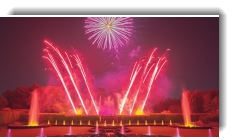
Studies have show that red can increase your heart rate/excitement. Would this color be helpful or hurt a health care website or sites with enormous product inventories that need time for you to browse.
In addition to psychological studies, you can also leverage nature…
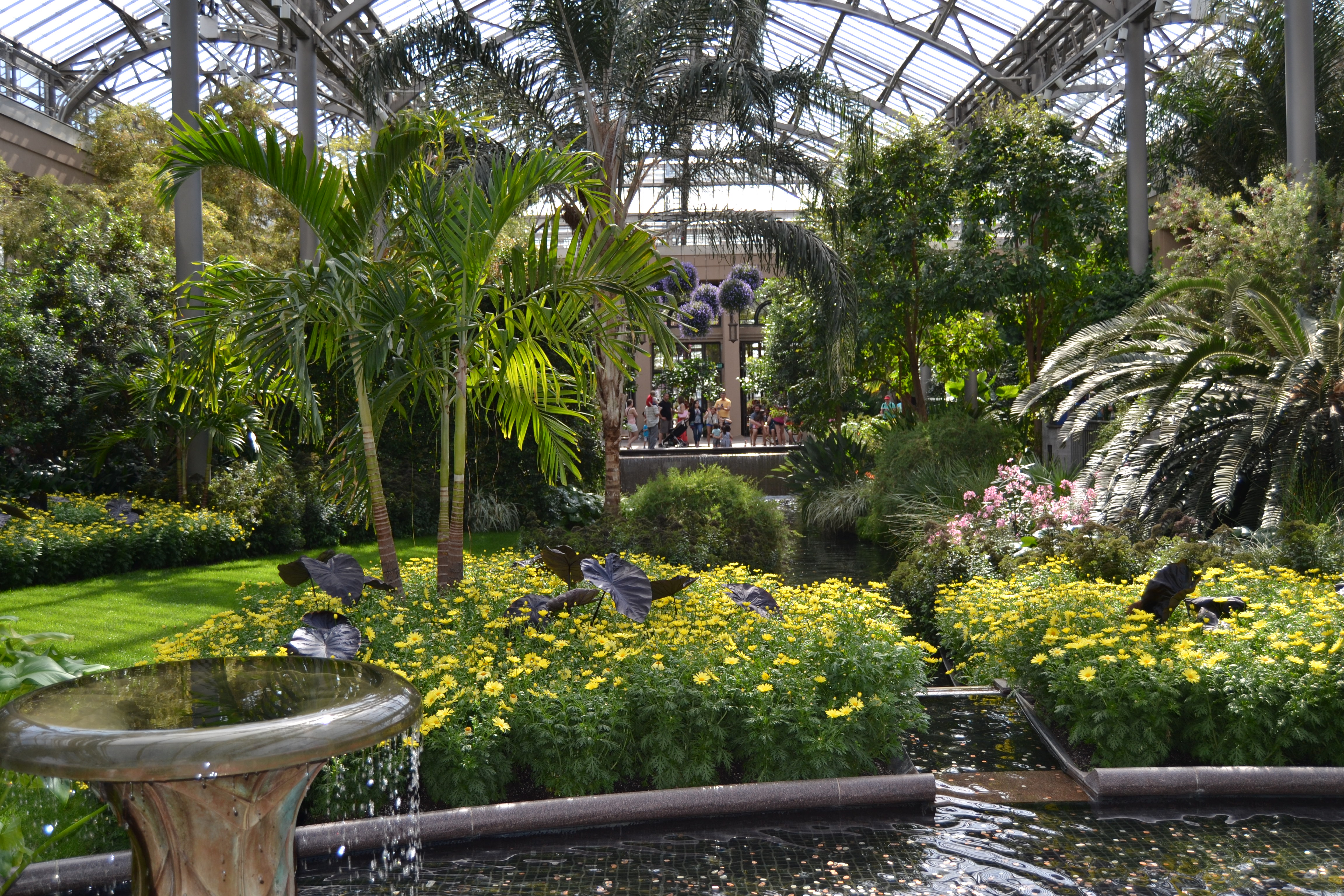 Mother nature often selects color schemes that are harmonious. These color schemes can be advantageous for websites in which you might want your site visitors to remain, read and study.
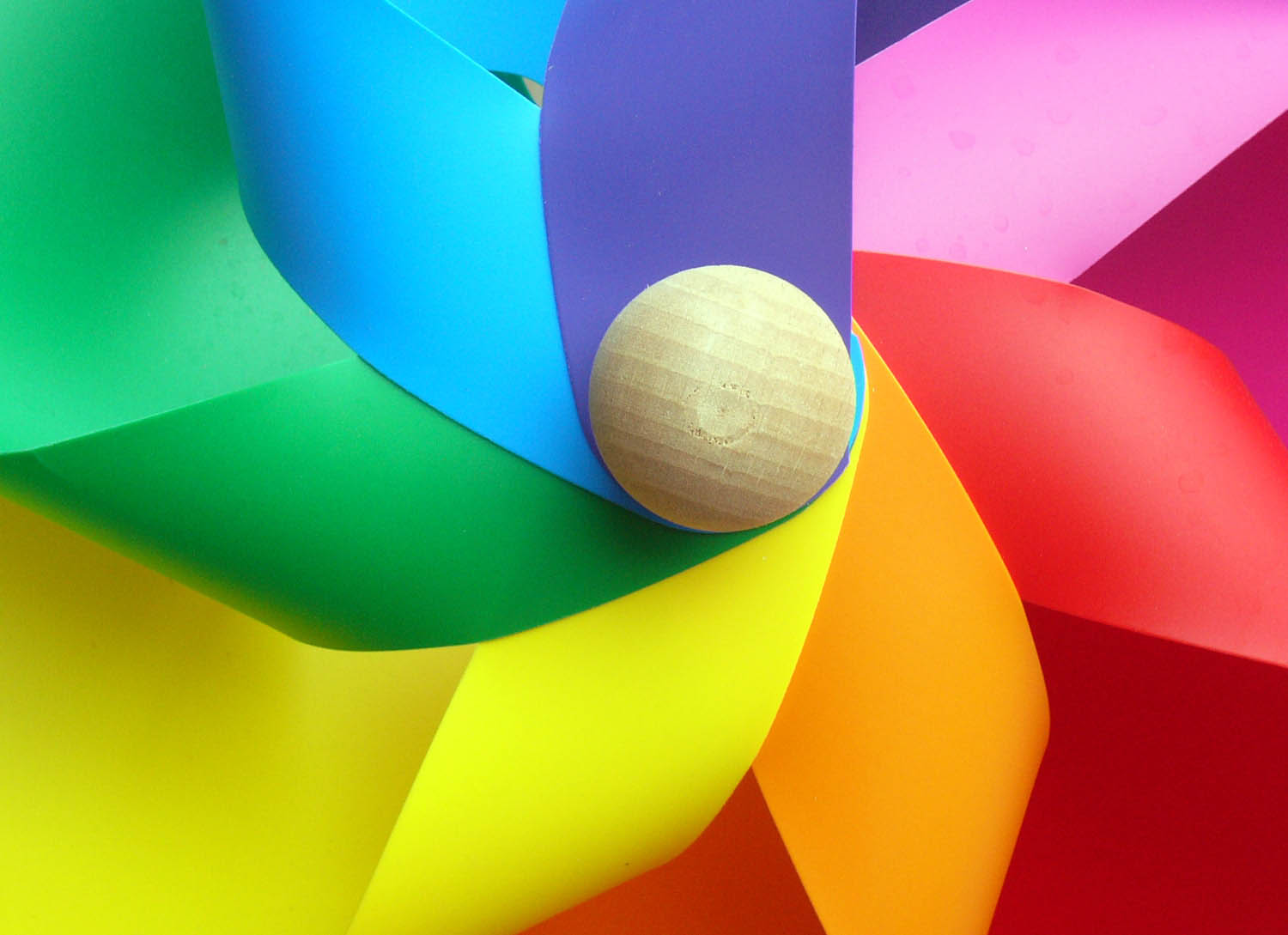
On the flip side, you can use bright and vibrant colors to bring attention to things of importance.
The key is realizing that the color scheme requires just as much attention and expertise as the wording of your website.
We have the tools to test and improve color rendering (as well as font dimensions) to ensure your website and brand is being represented in the best possible light. Feel free to contact us with your questions and further information on how to improve your customers experience and your results with your website.